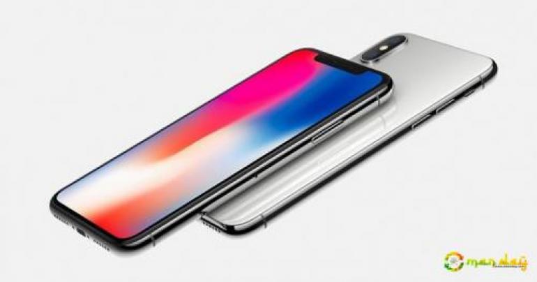
iPhone X Review: Best. iPhone. Ever.
I got to spend some time with the iPhone X (thanks to AT&T), and I can understand Apple's vision for the future of the iPhone.
The iPhone X shares a lot of its internals with the iPhone 8 and 8 Plus. They all use the same A11 Bionic CPU, the same graphics processors and the same cameras.
Gone is the home button. After 10 years, the front of the iPhone X is button-free.
It was a strange feeling of familiarity and being completely lost. I've been using an iPhone since the beginning, and thought I knew almost everything about how to use it.
I wanted to take a screenshot on the iPhone X, and I had no idea how to do it.
To Apple's credit, I did figure it out in a few seconds (you press the sleep/wake button and the up volume button at the same time).
By the way, the sleep/wake button on the X is called the side button. I'm hoping Apple will base future models on the X, so I expect we'll be calling it the side button from now on.
In my recent review of the iPhone 8 Plus, I wrote of my choice to go for the Plus model with the larger screen and the Touch ID sensor in the home button.
I've only used my 8 Plus for a few weeks, but since I'm a big guy, the larger iPhone feels very comfortable in my hand.
When I took the iPhone X out of the box, it felt unusually small, but when I held it up next to my 8 Plus, the X's screen is a half-inch taller.
So the iPhone X is a nice change in design for Apple, but Samsung was first up with an edge-to-edge screen without physical buttons.
My time with the iPhone X was a little like driving a rental car — it's newer than your car at home, and the controls are all there somewhere, but it takes a few days to find them all.
...[ Continue to next page ]
tag: blog , technology
Share This Post


